Introducing the Canadiens' New 3D Center-Ice Logo: A Tribute to History and Tradition
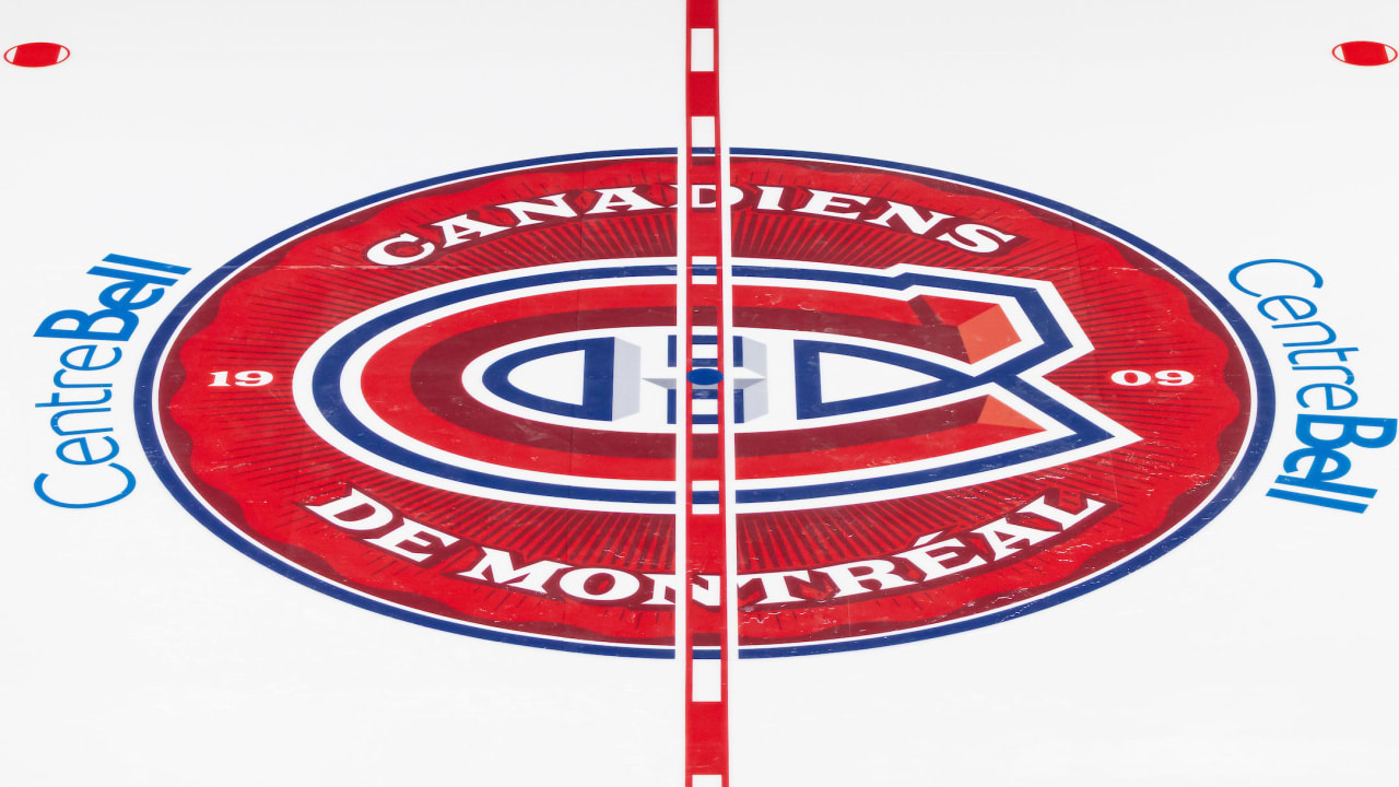
The Canadiens have introduced a new full-color, 3D-styled center-ice logo at the Bell Centre for the upcoming season. The logo features a red design with references to the team's history and market. The central face-off circle is now entirely filled with red, replacing the previous oversized Canadiens logo.
The new logo includes elements such as the founding year of the team in 1909, the team's official name in French - Canadiens de Montréal, an embossed circle inspired by the Stanley Cup, and the dominant red color of the team's home jersey. These elements highlight the team's rich history and unique identity within the NHL.
Fans will have the opportunity to see the new center-ice logo in person for the first time during the Prospect Showdown on Sept. 13-14. The event, presented by IGA in collaboration with Voisin, will showcase the new logo design. Tickets for the games start at just $10 and can be purchased online.
In conclusion, the Canadiens' new center-ice logo brings a fresh and vibrant look to the Bell Centre, symbolizing the team's rich history and strong presence in the NHL. Fans can look forward to experiencing the new design firsthand at the upcoming Prospect Showdown event.