Exploring the Most Intriguing MLS Kits of the 2026 Season: From Tie-Dye Tributes to Futuristic Designs
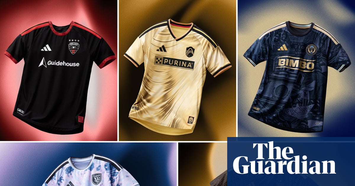
The upcoming 31st season of Major League Soccer is generating excitement among fans who are eagerly discussing various aspects of the league, including roster building, playoff potential, and, of course, the kits. Kit culture is a significant part of soccer fandom, and fans worldwide enjoy analyzing and critiquing the designs of their favorite teams' jerseys. In this spirit, I have compiled a list of what I believe are the five most intriguing MLS kits of the 2026 season, ranging from the good to the bad.
San Jose Earthquakes' "Dead Kit" pays tribute to the iconic Bay Area band, the Grateful Dead, with a vibrant tie-dye design featuring the band's logo and wordmark. This unique kit draws inspiration from the Grateful Dead's previous collaboration with the Lithuanian basketball team at the 1992 Olympics, where tie-dye warmups were worn. The design also harkens back to the infamous denim kit worn by the USMNT at the 1994 World Cup, which almost ended up being tie-dye. San Jose's bold choice reflects the Bay Area's cultural heritage and adds a touch of nostalgia to the MLS kit lineup.
Several MLS clubs have embraced graphic prints in their kits this season, with Houston Dynamo featuring satellite imagery of the city, New York Red Bulls opting for a peculiar motif, and Philadelphia Union paying homage to the city's historical significance with the 1776 Kit. While these designs aim to connect with fans and showcase unique elements, the Philadelphia Union's kit has received mixed reviews for its busy and streetwear-inspired look, which may not translate well on the field.
Los Angeles FC continues to impress with their 2026 Primary Kit, which incorporates the club's signature black-and-gold color scheme and draws inspiration from the city's art deco heritage. The kit features lenticular holographs on the Adidas logo and club crest, adding a futuristic touch to the classic design. LAFC's consistent attention to detail and aesthetic appeal set them apart in the realm of MLS kit design, showcasing their commitment to innovation and style.
Music and kit design have become intertwined in MLS history, with teams like Seattle, Nashville, DC United, and San Jose creating kits inspired by music icons. St. Louis City SC joins this trend with their Tina Turner Kit, a collaboration with the legendary artist that captures her energy and style. The gold, shimmery print and Turner's signature and silhouette on the jersey pay homage to her iconic career and influence on music, adding a unique flair to St. Louis' kit collection.
While MLS has moved away from traditional "clean" designs in recent years, some teams continue to opt for simplistic and uninspired kits. Teams like Colorado, Vancouver, Charlotte, and DC United have received criticism for their lackluster designs, with DC United's 2026 Black-and-Red Kit standing out as particularly underwhelming. The minimal effort put into the design and the generic explanation provided by the club reflect a missed opportunity to showcase creativity and innovation in kit design.
In conclusion, the 2026 MLS season promises a diverse range of kit designs that reflect each team's identity, history, and cultural influences. From bold and nostalgic tributes to music-inspired collaborations and futuristic holographic elements, the league's kits offer fans a visual representation of their favorite teams' spirit and style. As fans eagerly await the start of the season, the discussion around MLS kits continues to be a vibrant and engaging aspect of soccer fandom.